How to Visualize Anomalies in Dataiku Similar to This Chart?

Hi everyone,
I'm trying to create a chart in Dataiku to visualize anomalies in my dataset, similar to the example below:
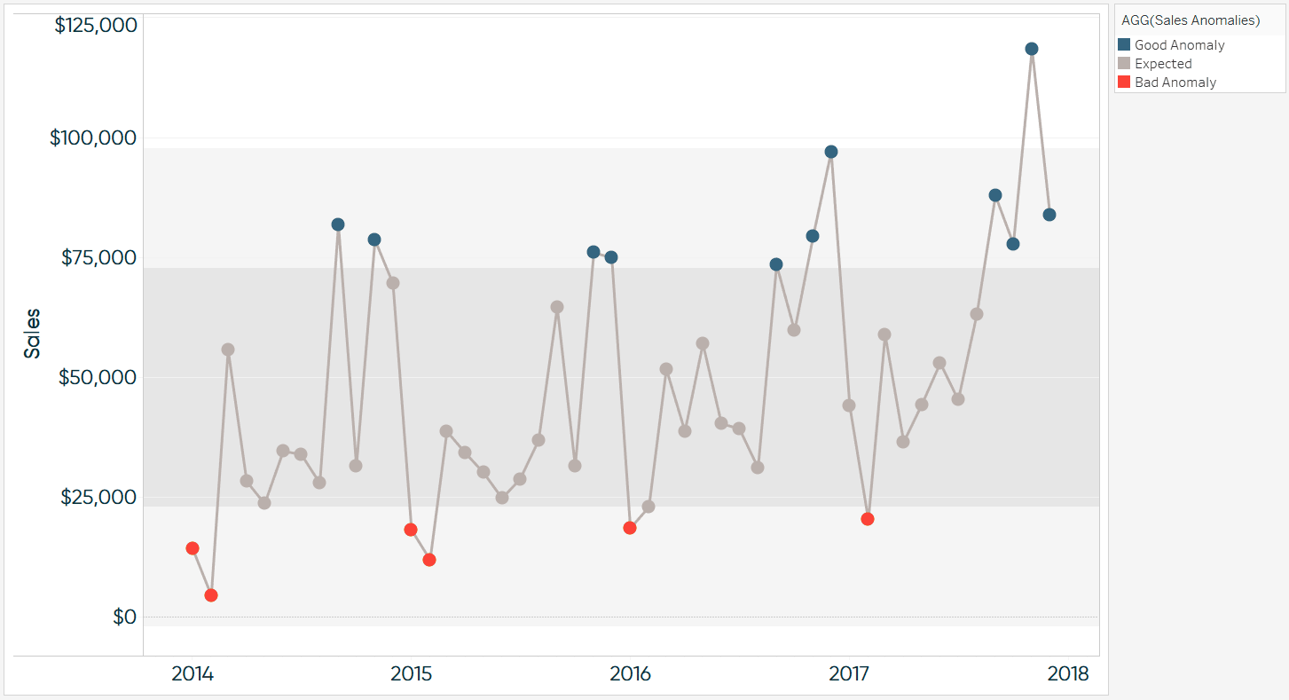
The chart highlights three categories:
- Good Anomaly (blue dots)
- Expected values (gray dots)
- Bad Anomaly (red dots)
I have the following columns in my dataset:
- Date/Time (for the x-axis)
- Sales (for the y-axis)
- Anomaly category (Good, Bad, Expected)
I would like to know:
- How can I create a similar visualization in Dataiku? can i use charts? what charts type?
- Should I use the built-in visualization tools or a Python notebook?
- Are there specific plugins or techniques you recommend for anomaly detection and visualization?
Operating system used: Ubuntu
Best Answer
-
I'm not aware of any built in functionality that would do this but I do not use the charting abilities often.
Here is some code that should get you in the right direction though! You could modify it to use two thresholds and even base them off of standard deviation or business goals.
import matplotlib.pyplot as plt


# Sample data

x = [1, 2, 3, 4, 5, 6, 7, 8, 9, 10]

y = [5, 15, 10, 20, 25, 30, 35, 40, 45, 50]


# Threshold value

threshold = 25


# Create a line chart

plt.figure(figsize=(10, 6))


# Plot the line with a single color

plt.plot(x, y, color='blue')


# Plot the dots with conditional formatting

for i in range(len(x)):

    if y[i] < threshold:

        plt.scatter(x[i], y[i], color='red')  # Red color for values below threshold

    else:

        plt.scatter(x[i], y[i], color='green')  # Green color for values above threshold


# Add labels and title

plt.xlabel('X-axis')

plt.ylabel('Y-axis')

plt.title('Line Chart with Conditional Formatting on Dots')


# Show the plot

plt.show()
Answers
-
So dataiku dont have a chart visualization? we must manual use python right?
-
It certainly has chart viz, but I am unsure if it has conditional formatting to the degree that you'd like it to. It looks like you may be able to specify the stops (and optional associated values) for a continuous or diverging palette for charts. See here:
https://doc.dataiku.com/dss/latest/visualization/palettes.html#custom-palettes
-
 Ashley Dataiker, Alpha Tester, Dataiku DSS Core Designer, Registered, Product Ideas Manager Posts: 166 Dataiker
Hi @raihand,
Depending on how you define an anomaly, you have a few options. If the numbers are fixed based on business metrics, you could build a line chart with a reference line for each threshold. That would give you a quick visual indication of which data points are where concerning the different thresholds that you've defined. You can do this from the Explore view, on the charts tab with a line chart.
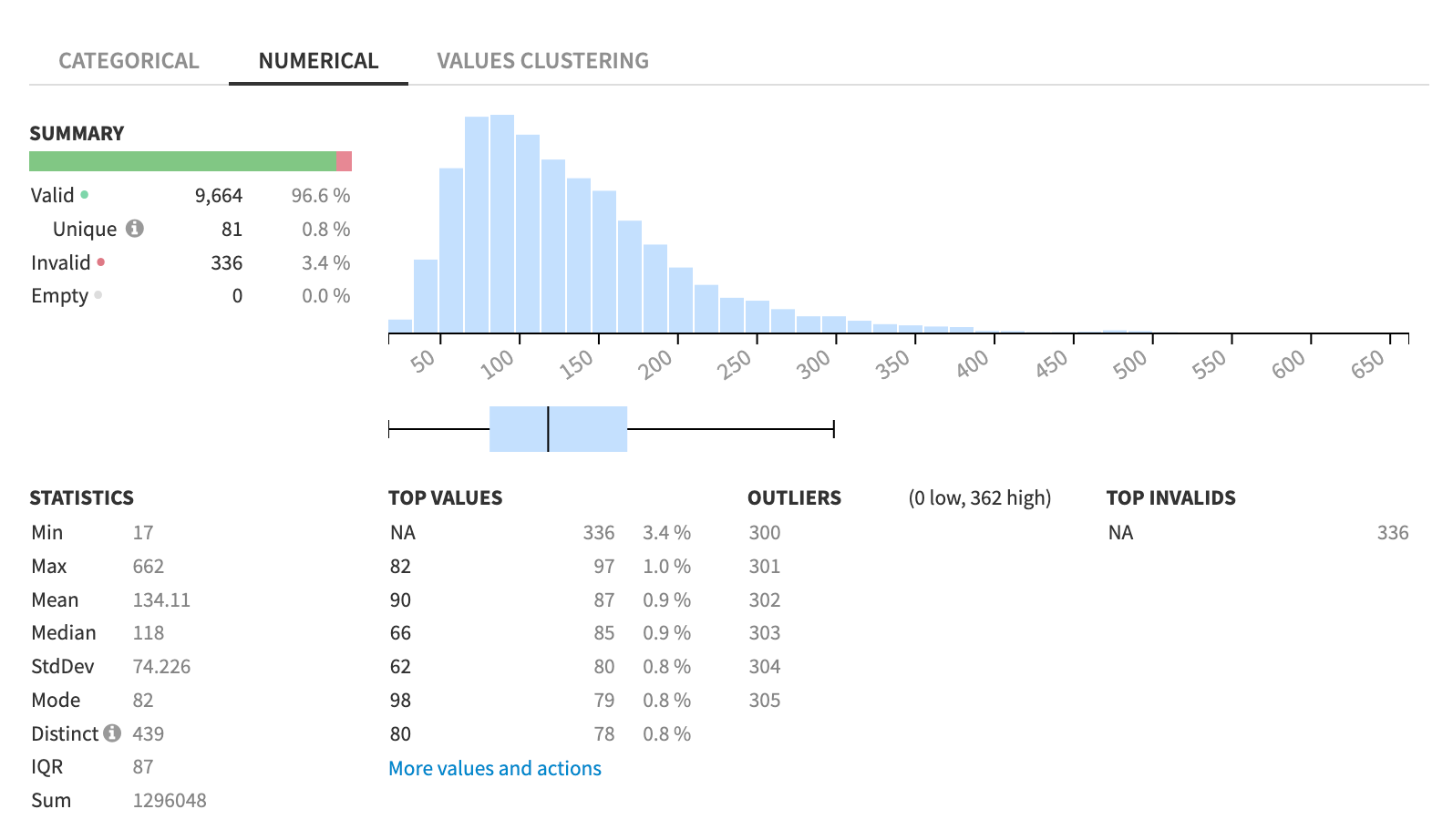
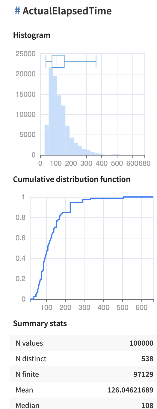
Another option would be to use the Analyse capability, also available in the Explore dataset view, to generate visual quick column statistics. You might also use a boxplot, which is a standalone chart type. Furthermore, you can use interactive statistics worksheets, also available when you open a dataset to generate deeper analyses of your data. I've added a few screenshots using sample data to give you an idea of what those look like.
Of course, python is always also an option :)
Best,
Ashley


-
Hi @raihanhd,
The most suitable chart type in DSS to do that would be the lines chart. It's not currently possible to achieve exactly what you want with it, but you can use reference lines as a workaround to visually split the points into the three categories.