How to chart time series longer than 20 data points?

I'm creating a dashboard for reporting abnormal data series, looking at the past 90 day sales. I want to create the line chart of the past 90 day sales to monitor spikes and abnormalities. But the line chart only shows about 20 data points and lump all rest into "other" categories. Is this the default setting of chart based on a datasets? How the chart show all 90 days of sales. The chart only the left is based on original data. On the right, I added a filter on date and manually deselected older days. But, I don't want to manually do this when I set it up as a daily job.

Answers
-
 DarinB Dataiker, Dataiku DSS Core Designer, Dataiku DSS ML Practitioner, Dataiku DSS Adv Designer, Registered Posts: 9 Dataiker
Hi @KJ,
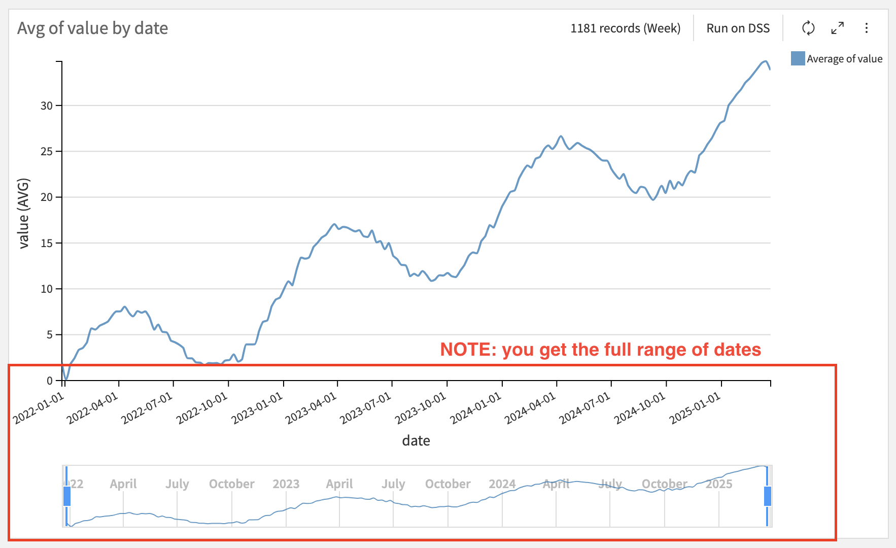
I suspect that your date variable (SOLD_DT) is actually being stored as string. The chart tool displays 20 items and groups the rest into "Others" by default for text. Note, you can change the number of items to display and toggle grouping off or on. You can see this in the following screenshot:

You could use the Prepare recipe to parse your date variable into a standard date format and date meaning. The chart tool will handle this type of data they way you want in your question.