Absolute Date and Time in Version Control rather than Relative time listings.

User Story:

As a Dataiku DSS Design Studio user who references the Version Control History I would like to be able to get a precise data and time when a change was made from the user Interface rather than the more generic relative 2 hours ago.  Of 3 hours ago.  Or 5 Months ago...  This will allow me to better coordinate with other things going on outside of DSS. Helping to understand bugs and changes that might have been introduced into my workflows.

Notes

Today it looks like this.  If the date could be changed at the user level to absolute.  Or when clicking into a particular change there was consistently a place to see the absolute time of each change.
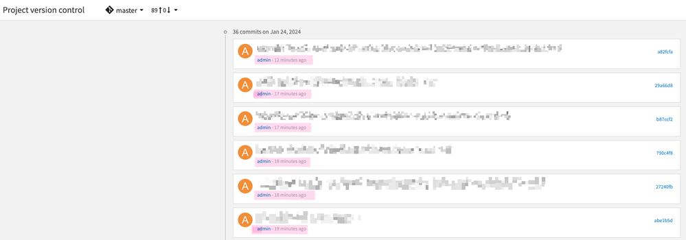
The Current Version Screen 12.4.1 version screen showing relative  dates and times rather than absolute values.The Current Version Screen 12.4.1 version screen showing relative dates and times rather than absolute values.


--Tom
2 Comments

100% gets my vote and it applies to all date/times throughout the UI. I get that Dataiku is trying to make the UI simpler but they need to consider how can the full value be seen in the GUI. For instance on the Jobs screen on the job listing on the left it may say "8 days ago". Now the developer had the insight of actually creating a Hover Text/tooltip but totally missed the opportunity and just said the same thing as the GUI: "This job was started 8 days". Really silly to use a Hover Text/tooltip to say the same thing. At least in this screen it is possible to dilldown to the jonb and see the actual start date/time of the job and the duration, but not the end date/time which can difficult to calculate for long jobs. So perhaps one solution could be to have Hover Text/tooltips with the full value as this is the best of both worlds: simple UI but advanced users can get the actual values without having to use API calls.

Screenshot 2024-01-25 at 19.10.23.png

@Turribeach 

I'll plus 1 the extension you are adding to my proposal.  These relitive times are pretty.  But are not useful. It would also be good if these times were in my local time zone.  However, I'd take it in UTC.


--Tom

@Turribeach 

I'll plus 1 the extension you are adding to my proposal.  These relitive times are pretty.  But are not useful. It would also be good if these times were in my local time zone.  However, I'd take it in UTC.