Sign up to take part
Registered users can ask their own questions, contribute to discussions, and be part of the Community!
Registered users can ask their own questions, contribute to discussions, and be part of the Community!
The second Conundrum is here!
A company has separate datasets for the 2016 and 2015 numbers and needs to compare a subset of 2016’s numbers with the numbers from 2015.
Given the two datasets "orders_2015" and "orders_2016", create a single visualization that answers the question, "Did we sell more Hoodies in 2016 than in 2015 in the first 25 days of December?"
Good luck - I hear there are stacks of clever ways to go about it!
Once you have your answer please export your project and upload it here so we can all learn from each other's efforts! Refer to our Submission Guidelines to see how to properly export your project.
I stacked the two datasets, kept all the rows where order_date_month=12, order_date_day was between 1 and 25 and tshirt_category='Hoodie'. Then I created a 'sales' column equal to tshirt_price*tshirt_quantity.
For the chart I decided to draw two barplots, one representing the cumulative sum of 'sales' by day and the other one representing the cumulative sum of quantities by day with two different colors for each year.
The 2 last bars thus represent the overall result for the 25 first days of December.
I hope I helped!
I followed a similar path to Anita, importing the two .csv files into a single dataset then grouping and pivoting the results by year. I used the quantity of hoodies sold rather than the revenue in Antia's solution - I think revenue is a better measure though!
I created a chart showing sales by day for December only, year-over-year, however I found this didn't provide the answer really quickly, so I also made a pivot table where I summed up the sales by year and displayed the totals (which I won't post here).
Thank you both for your submissions! I love that you each took a similar yet different path to reach the goal!
Thanks for taking part and I look forward to seeing more submissions from you both in future 😀
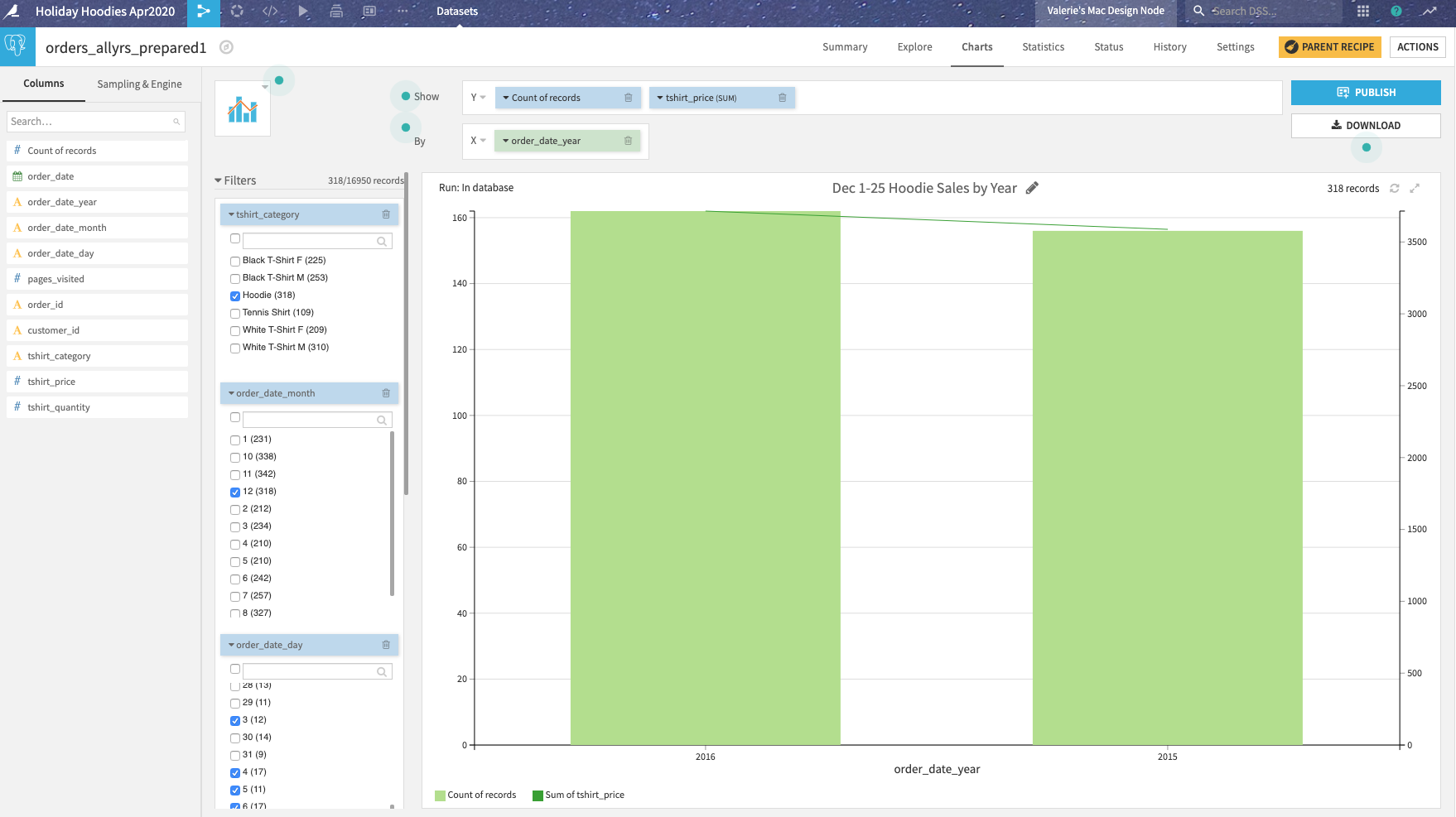
I determined that, yes, we sold more hoodies Dec 1-25, 2016 (162 hoodie orders) than in Dec 1-25, 2015 (156 hoodie orders). Since the price of hoodie did not change year to year, the revenue in 2015 is also less given fewer orders.
I stacked the datasets to create a single dataset of all orders. I created all the filtering in the chart itself to isolate the dates of interest.
hi @MichaelG another one, this is probably a more straight forward one.
As others, stack, filter for December and days <= 25, then build visualisations.
I built two, one aggregate and one cumulative per day.
One small trick I used was to upload both files into the same dataset, this saves me a stack recipe if the structures are the same already!
@Liev Nice trick uploading both files into the same dataset! 😁
Hello @MichaelG .
Here is my response (hopefully not too late).
I did uploaded both files and filtered for Hoodies, December & 1 - 25. Also created Sales as price * quantity.
Made 3 bar charts:
- Amount of transaction (2015 lower then 2016)
- Sales (2015 higher then 2016)
- Total Quantity (2015 higher then 2016),
Based on these charts, I conclude that the answer is no (total quantity Hoodies sold in 2016 are less then 2015)
This is my first Conundrum and wanted to provide a few methods for answering this questions.
For more details check out my GitHub page.
Thank you for sharing @MikeyData!
.png")


