Sign up to take part
Registered users can ask their own questions, contribute to discussions, and be part of the Community!
Registered users can ask their own questions, contribute to discussions, and be part of the Community!
Hi @prash_,
Can you show a full screenshot of your chat in DSS so that we understand exactly which fields you are charting?
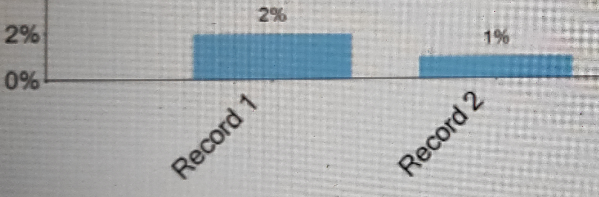
If your are displaying a numeric value like so, you can select "Percent scale as the compute option":
You could also use a chart like the "Vertical stacked bars 100%" chart, which will show percentages on the left-hand labels by default.
If you pass along your full chart screenshot and a screenshot of the options for the label column similar to the one above, we can discuss what other options might apply!
Thank you,
Sarina

