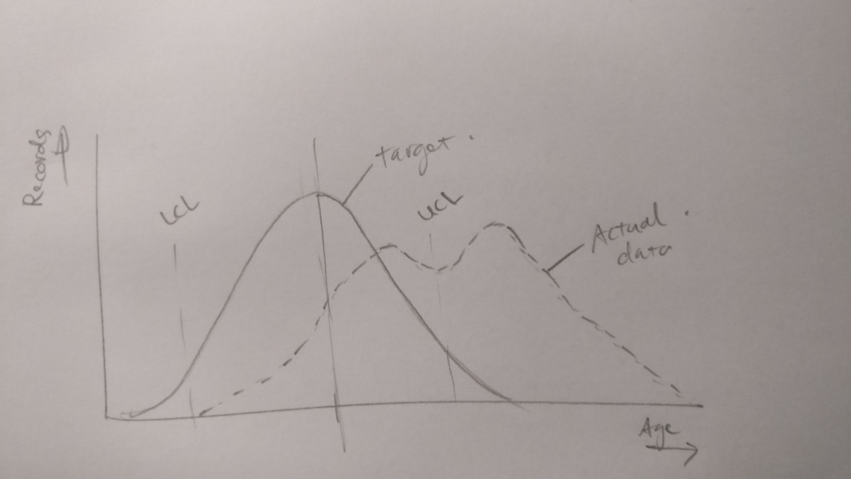
I would like to visualize a data set as drawn below comparing an actual set of data to a target deviation with lower and upper control limits. Does anyone have a suggestion how to do this in Dataiku? Suggested tutorials or coding would be appreciated.