- Subscribe to RSS Feed
- Mark as New
- Mark as Read
- Bookmark
- Subscribe
- Printer Friendly Page
- Report Inappropriate Content
Clearer visual experience when working with Partitioned Visual Model summary screens
User Story
As a new Dataiku DSS user getting familiar with building partitioned visual models, I would like it to be clearer that there is a set of summary graphics for each of the partitions. This would make using the partition feature easier and build confidence in users. Making this feature feel less like an "easter egg" and more like a productive feature.
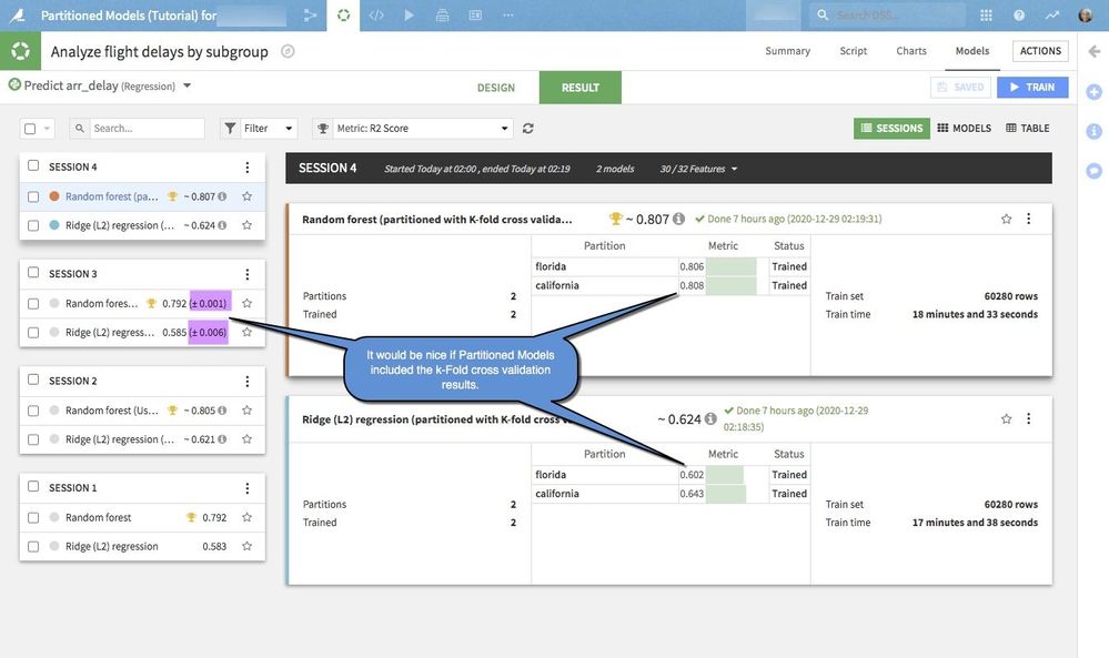
As a creator of partitioned visual models trying to use best practices of k-fold cross-validation testing, it would be helpful to see the (± 0.###) on the summary screens as we do with non-partitioned models. This would allow for a quicker comparison of models.
Notes:
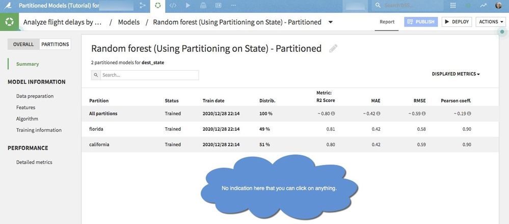
- No indication when you look at the screen you can click on anything.
- Hover over "All Partitions" no underline indication that you can click on the word "All Partitions"
- Even though you do not have a clue click on All Partitions and you get a graph similar to but not the same as the documentation here.
- Click on the All Partitions "trained link" and you are taken to a training session log.
- Click on the name of the 1st partition in this case Florida. Or second portion name California in this case you get a different behavior and are taken to the partition Model summary page.
- Click on the Florida or California trained link and you are taken to a training session log.
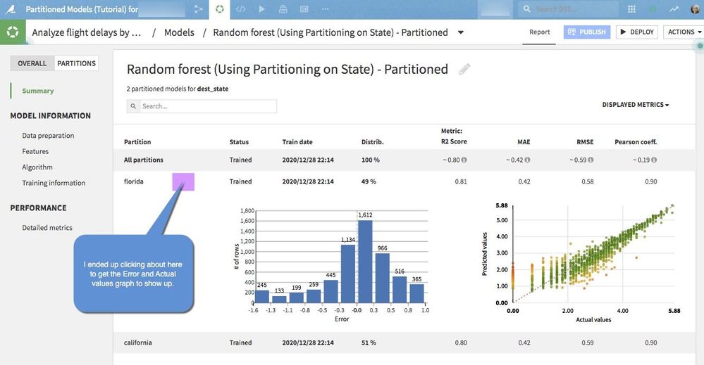
- However, there appears to be nothing to click on to get the behavior described in the training session. One end up having to click on the gray space between values on this summary screen to re-produce the feature shown in the training.

What I was trying to produce was the following as shown in the training materials.

For the second comment about k-fold cross validation here is what I'm currently seeing.

For this testing, I'm using DSS V 8.0.4.
cc: @AshleyW